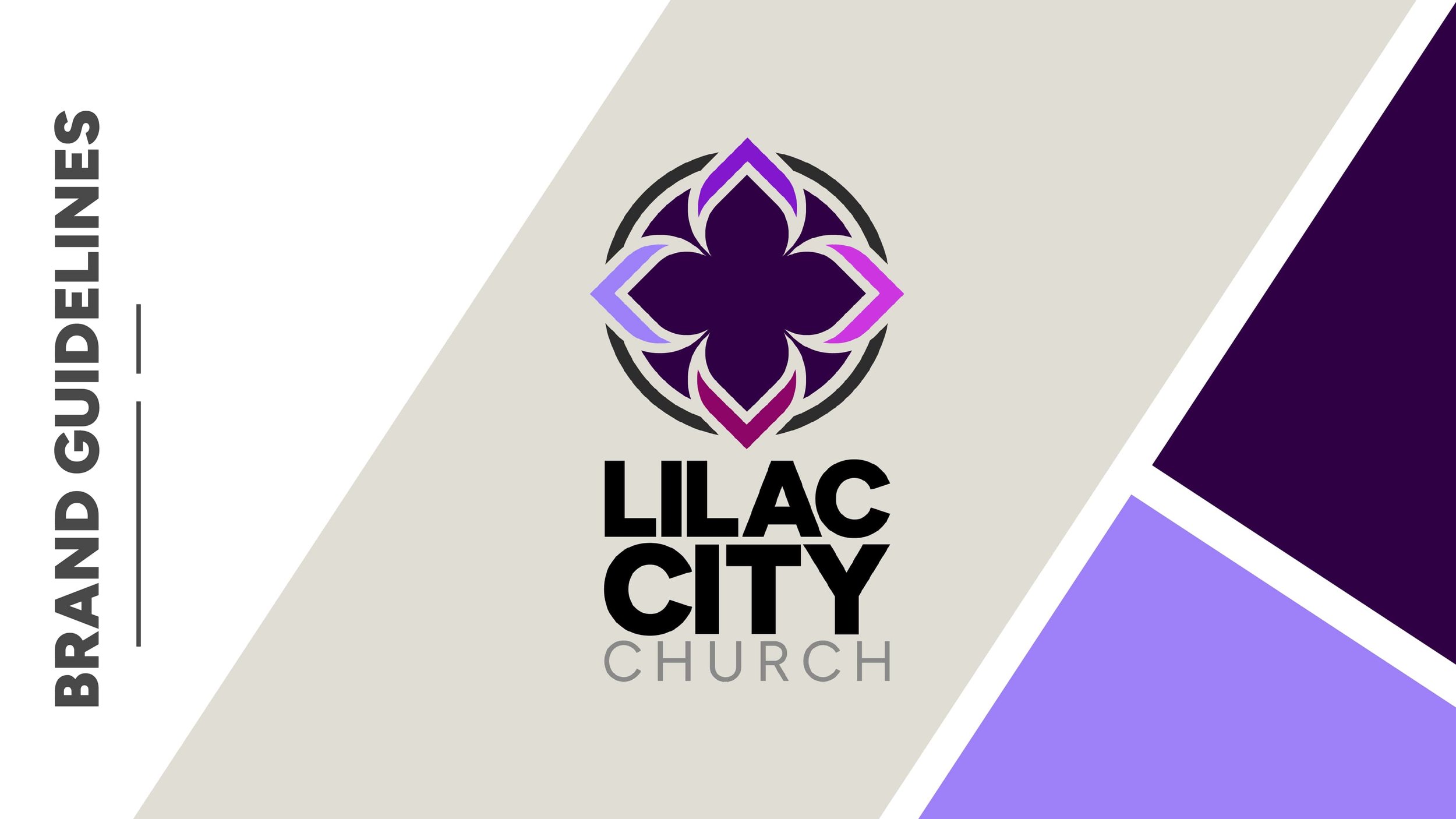
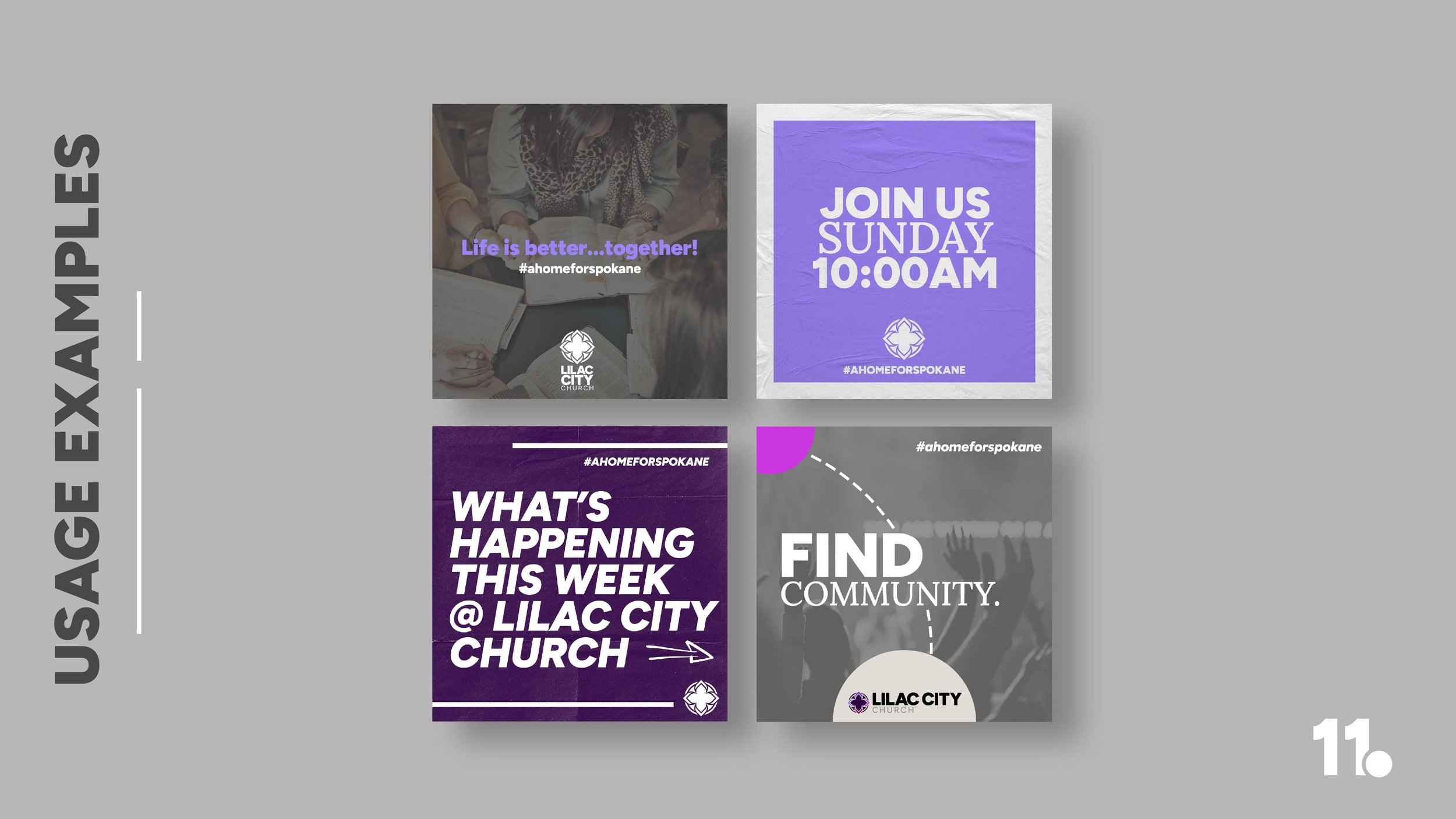
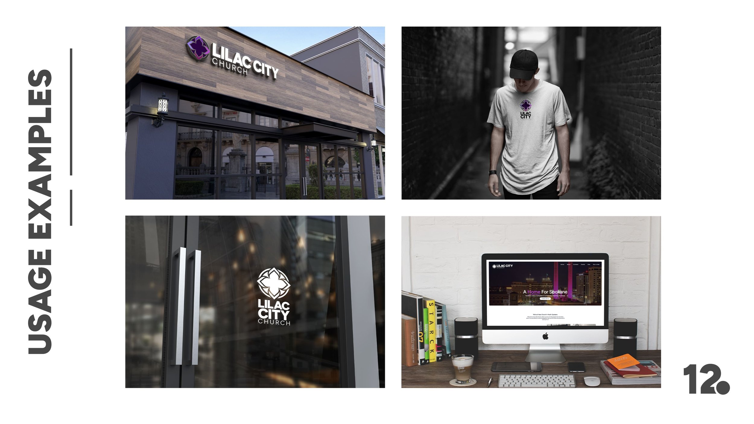
LILAC CITY CHURCH BRANDING

We had the privilege of developing the brand identity for Lilac City Church, a new church in Spokane, Washington. Rooted in their mission to be a home for Spokane, the church draws inspiration from Spokane’s nickname—The Lilac City. By embracing this local identity, we helped create a brand that reflects their deep community connection and clearly communicates their mission and vision.

A circular logo with a stylized purple and black floral pattern above the words "LILAC CITY CHURCH" in bold black and gray letters.
A stylized, geometric emblem with purple, violet, and black colors, featuring symmetrical shapes and a central floral-like design.
A black decorative wall shelf with a framed map, a small potted plant, and a ceramic vase.
A black and gray symmetrical floral design or pattern with geometric elements.
Black and white circular floral pattern with symmetrical geometric shapes.
Young man walking in a narrow alleyway with brick walls on each side, wearing a black cap and a light gray T-shirt with a logo and the text 'LILAC CITY CHURCH' on it.
Glass door with Lilac City Church logo and name aligned in the center, showing a city street reflection.
Purple background with white bold text announcing events at Lilac City Church, including a hashtag #AHomeForSpokane and an arrow pointing right.
A purple textured background with white text announcing a church service on Sunday at 10:00 AM, including a decorative emblem and hashtag #AHOMEFORSPokane.
A promotional graphic encouraging community engagement, featuring raised hands, blurred background, Lilac City Church logo, and hashtags #homeforspokane and Find Community.
A group of people gathered around a table reading and discussing the Bible together, with the text 'Life is better...together! #ahomeforspokane' and a Lilac City Church logo.

READY TO START YOUR PROJECT?